Detail projectss

Packaging & Visual Framework for Aurora

Rebranding a premium melatonin gummy to dominate retail shelves. We developed a cohesive visual identity, modern packaging design, and a dream-inspired color palette to drive consumer trust and retail pick-up.

Overview

Aurora, an emerging wellness brand, needed a distinctive visual identity and packaging system for their flagship melatonin gummies. Launching in a crowded sleep-aid market, they required a brand framework that felt both scientifically trustworthy and beautifully calming to the modern consumer.

Client

Aurora Wellness Co.

Service

Packaging & Visual Identity Framework

Duration

1 month

Challenges

Solutions

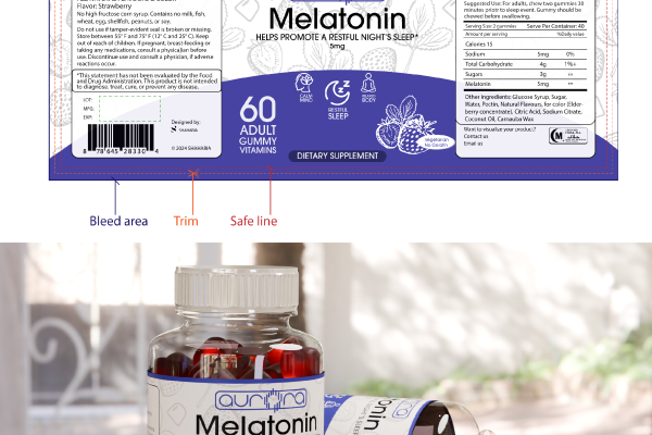
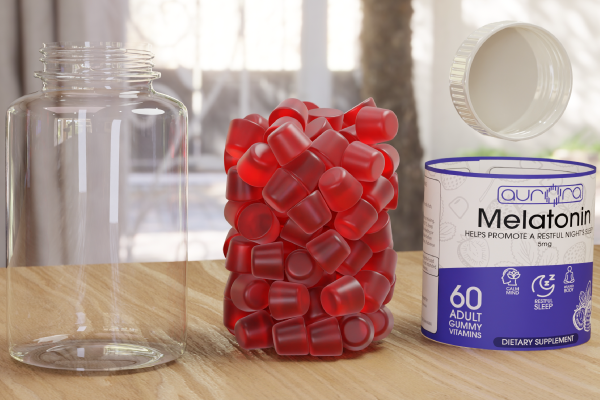
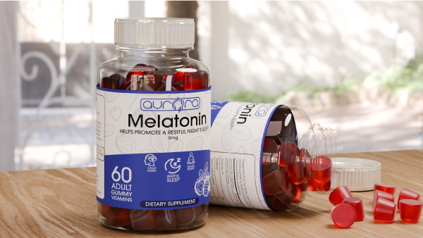
To address these challenges, we developed a comprehensive brand system rooted in the psychology of sleep. We curated a soothing visual framework using deep twilight gradients and soft celestial accents to immediately evoke a sense of calm. For the packaging, we opted for a custom matte-finish bottle paired with minimalist, clean typography to strike a balance between clinical credibility and lifestyle-focused wellness. Finally, we engineered a scalable label architecture that seamlessly accommodates mandatory FDA disclosures without cluttering the brand’s premium aesthetic.

Impact

Start aligning your Brand

Nobody Listens? We Do!​

Partner with Alignedge to transform your commercial objectives into an undeniable visual reality. Let’s build a brand that works as hard as you do.